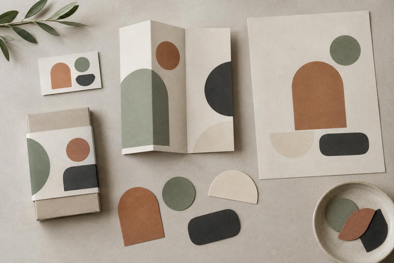
Start with what shapes need to communicate
A shape language is the set of forms and relationships that recur throughout a brand’s visual identity. It can include the curve of a frame, the corners of a card, the outline of an icon, or the way shapes overlap. Consistency does not mean placing the same decorative shape everywhere. It means making choices that feel connected, even when each piece has a different purpose.
Before drawing, write down three qualities the brand should express. Make them specific enough to guide a decision: “open and approachable” is more useful when paired with a visual direction such as generous space and soft transitions. Then list the places shapes will appear, from a small social post to a presentation slide or product label. This keeps the work grounded in actual use rather than in a single attractive composition.
Try a quick audit of existing materials. Collect a few layouts, images, illustrations and interface elements, if available. Circle the shapes that already recur and mark those that conflict. The goal is not to preserve every earlier choice. It is to find a starting point and identify what a new system needs to bring together.
Choose a small family of forms
Begin with one or two base forms rather than a large library. A brand might use rectangles with one rounded corner, while another builds from circles and straight dividers. Explore variations by changing scale, proportion or orientation before adding a new kind of shape. A small family is easier to recognise and easier for a team to use.
Give each form a job. One shape might frame a photograph; another might hold a short message; a third might act as a subtle marker in a diagram. If two shapes do the same job without adding a useful distinction, consider removing one. For example, a studio whose work centres on making connections could use paired arcs to group related ideas. The arcs can change size across formats while retaining the same basic relationship.
Make a simple exploration sheet with several versions of one content item. Keep the words and imagery fixed while changing only the shapes. This helps you judge the shape language itself, rather than being swayed by a stronger photograph or headline. Look for a family that supports the content without demanding attention in every layout.
Define the rules behind the look
A shape becomes part of a system when someone else can reproduce it. Record its key features: corner treatment, typical proportions, stroke weight if applicable, and how it aligns with text or images. Include what may change. A frame might stretch horizontally to fit a headline, for instance, but keep the same corner radius and margin from nearby content.
Rules for relationships matter as much as rules for individual forms. Decide whether shapes may overlap, whether they can be cropped by an edge, and how much space they need around important information. Make the distinction between a usual approach and an exception clear. A shape that sits behind a photograph may need different treatment from one carrying text.
Avoid rules so rigid that every output looks identical. Create a few approved arrangements, such as a quiet layout for detailed information and a more expressive layout for announcements. Both can use the same underlying forms. This gives designers room to respond to content without rebuilding the visual identity from scratch.
Test the system in awkward situations
A shape language should work beyond its best-looking example. Test it at small and large sizes, with short and long headlines, and with both busy and simple images. Put it into a narrow mobile layout, a text-heavy document and a format that leaves little room for decoration. These tests reveal whether the shapes help organise information or compete with it.
Check legibility whenever a form carries or touches content. Text needs enough contrast and breathing room; an unusual crop should not hide an important part of a photograph. Also test the system without colour. If the forms only feel related when they share a particular palette, their geometry or placement may need clearer rules.
Ask a colleague to create one new layout using only your draft guidance. Notice where they hesitate or improvise. Their choices can show which instructions are missing. Revise the guidance, then repeat the exercise with a different piece of content. The aim is not to eliminate interpretation, but to make the intended decisions easy to understand.
Document a flexible toolkit
Finish with a short reference that shows the base forms, their permitted variations and several examples in context. Pair each example with a plain-language note explaining why the shape is there. “Use this frame to separate a case-study image from supporting text” is more actionable than “use dynamic shapes.” Include at least one example of a choice to avoid, such as stretching a circle into an oval when that variation is outside the system.
Keep reusable shapes and layout templates together where the team already works. Name the elements by function rather than by vague appearance, so people can find the right one. Revisit the toolkit when a genuinely new format exposes a gap, but resist adding a new shape for every request. A useful shape language is not a collection of finished compositions; it is a small, dependable set of decisions that helps different pieces of work belong to the same brand.