Start with the job the logo needs to do
Before choosing a shape, list the situations in which people will meet the logo. A studio name on a proposal cover has room to be read. A profile image may have only a small square. Packaging, presentation slides, signage and social posts each place different demands on a mark. The useful question is not “Which type of logo looks most impressive?” but “What must people recognize, and where?”
A logo is one part of a visual identity, not a substitute for a clear name, consistent writing or thoughtful design choices elsewhere. Its structure determines how the name and any graphic element relate to each other. The three common starting points are a wordmark, a symbol and a combination mark. You can explore all three before deciding which deserves further development.
When a wordmark makes sense
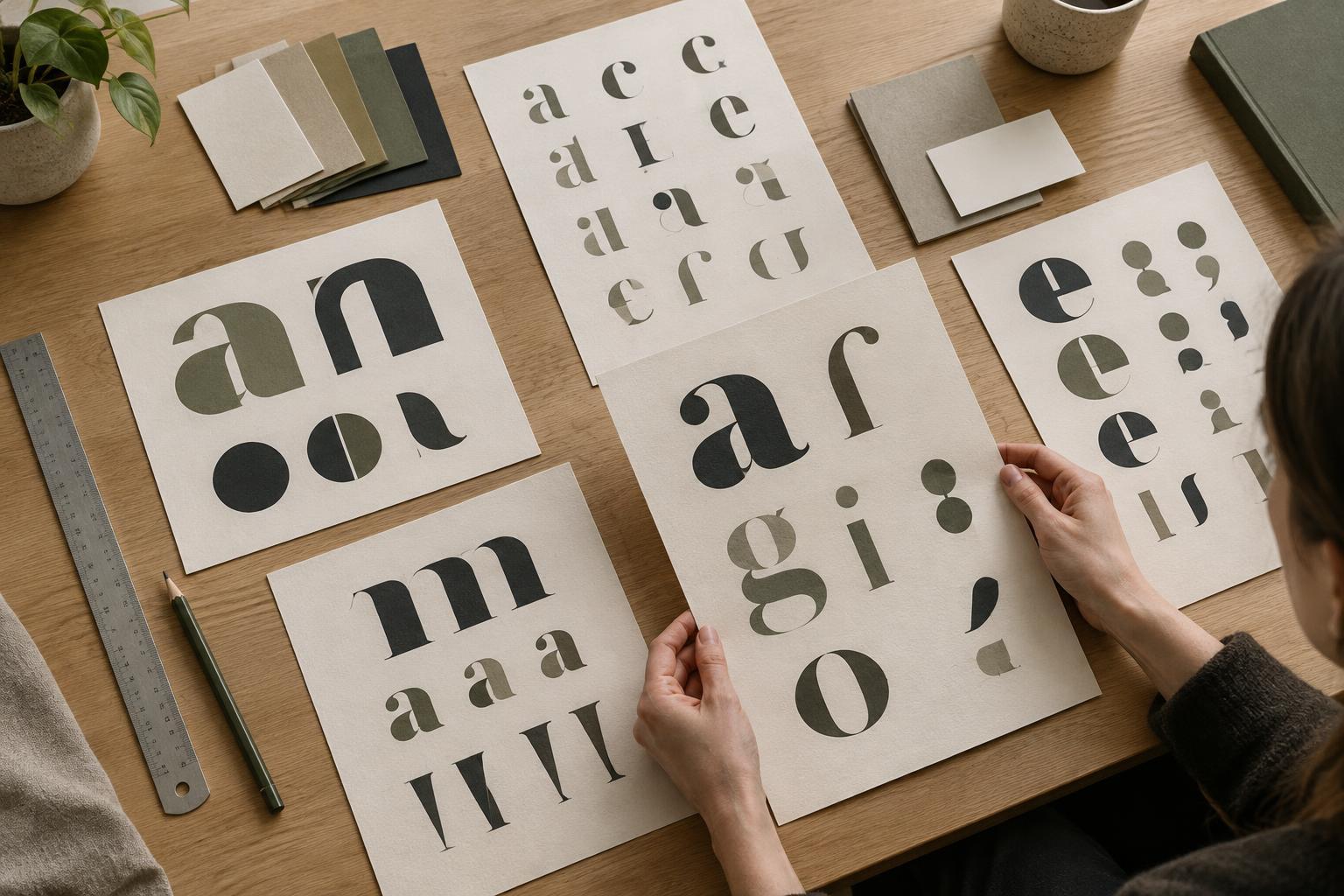
A wordmark presents the name as the main visual element. Letterforms, spacing, weight and proportions give it character without relying on a separate icon. This can be useful when the name is short enough to read comfortably and when helping people remember that name is a priority. A carefully drawn wordmark can feel expressive; it does not need a pictorial detail to look distinctive.
Its weakness appears when the name must fit an especially small or narrow space. Long names may become hard to read in a profile image or at the foot of a photograph. Rather than squeezing the letters, consider whether a shorter approved name, a different layout or a supporting graphic system would solve that particular application. Check a wordmark at the sizes and on the backgrounds you expect to use, not only at a comfortable size on a white page.
When a symbol can carry the identity
A symbol is a graphic mark that can appear without the full name. It may be abstract, typographic or representational. Symbols are useful where space is limited and a compact shape is easier to place than a line of text. But a new symbol rarely tells an unfamiliar person what to call you. If recognition of the name matters, plan for the symbol to appear alongside the name in introductions and other important contexts.
Avoid assuming that an obvious picture of your service is the clearest choice. A camera is easy to read as “photography,” for example, but it may say little about the particular practice behind it. An abstract shape offers flexibility, though it may take more consistent use before people connect it with your name. Whatever direction you try, test whether the shape remains identifiable in one colour and at a small size. Visual simplicity helps, but it is not a guarantee of distinctiveness.
When a combination mark offers flexibility
A combination mark pairs a name with a symbol. The two can sit side by side, stack vertically or form a closer unit. This structure lets you show the name while introducing a compact graphic element. It can suit a team that needs a readable identity on documents and a smaller mark for places where the full name will not fit.
The trade-off is the need for clear usage rules. Decide which arrangement is the primary logo, when a stacked version is appropriate and whether the symbol can stand alone. The relationship should still work when the mark is reproduced simply; if tiny details or a particular colour effect are essential to understanding it, everyday use may be difficult. A combination mark is not automatically the safest option: two elements that compete for attention can be less clear than one well-resolved wordmark.
A simple exercise for making the choice
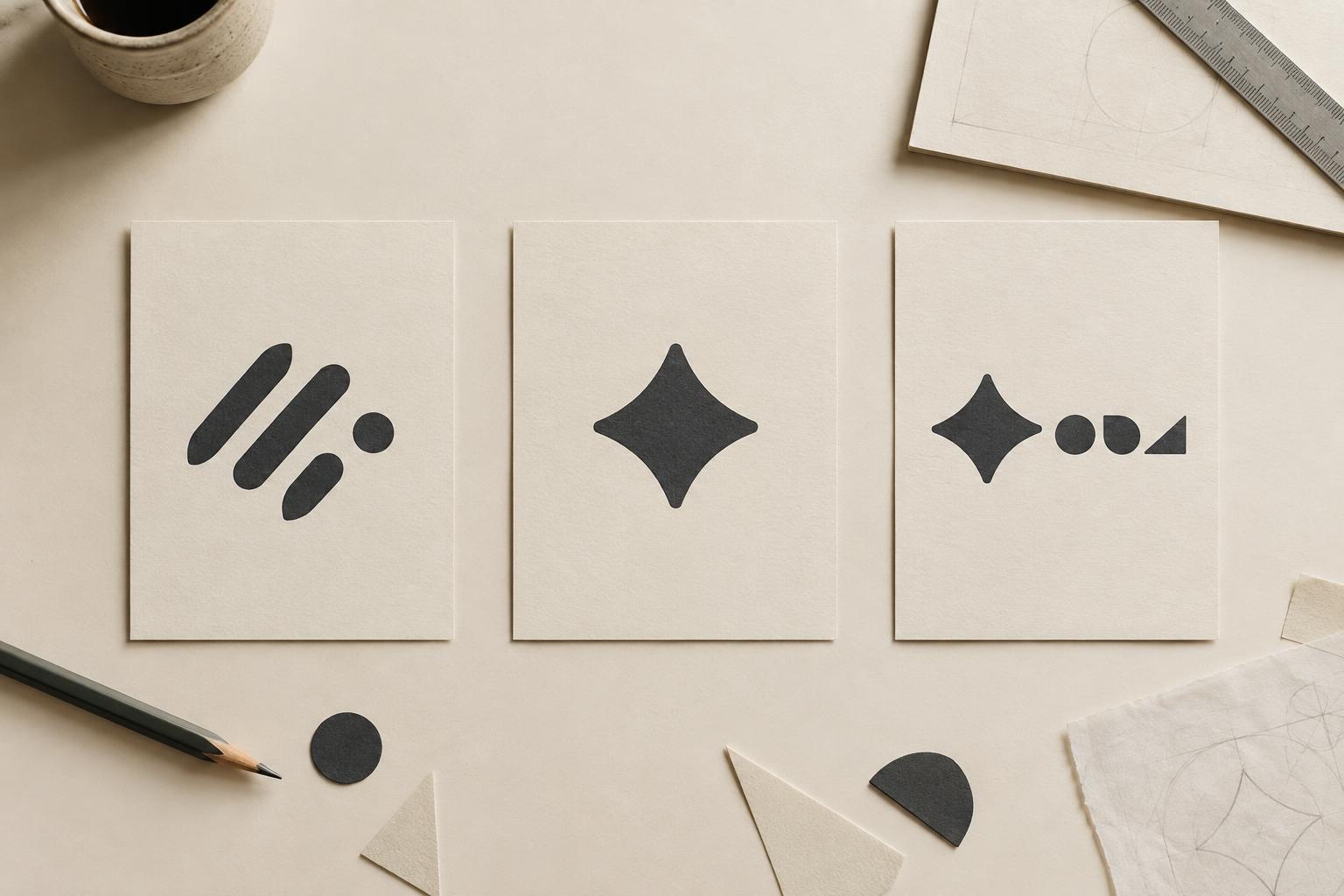
Make three quick directions using the same name: a type-only wordmark, a symbol with the name shown nearby, and a combination mark. Keep these as rough black-and-white sketches so polish does not decide the outcome too early. Put each direction into the same set of realistic examples, such as a website header, a proposal cover and a small profile image. Do not judge the sketches in isolation.
For each example, ask three questions: Can someone read or identify what matters? Does the structure fit the space without awkward rearrangement? Can the team use it consistently across its usual materials? Note where each option succeeds or struggles. You may find that a wordmark is strongest as the primary logo while a compact supporting element would help in smaller spaces. The aim is not to select the most elaborate sketch; it is to choose a structure you can develop into a clear, usable identity.