Why the distinction matters
A client asks for a new brand when they need a logo. A designer presents a logo when the client expected a complete visual system. Neither person is necessarily wrong about what needs attention, but they are describing different scopes of work. Clarifying the terms early makes it easier to agree on what will be designed, where it will appear and what decisions need to come first.
Think of the three terms as connected layers rather than competing definitions. A brand is the broader impression people form of an organisation or offering. A visual identity is the set of visual choices used to express it consistently. A logo is one identifiable element within that identity. Changing one layer may affect the others, but the layers are not interchangeable.
Brand: the broader impression
A brand is how people come to understand and recognise a business, project or person. Its name, products, service, language, behaviour and appearance all contribute to that impression. An organisation can decide what it wants to stand for and make choices that support it, but it cannot fully control what every customer or audience member thinks.
For example, imagine a small ceramics studio that wants to be known for approachable, hands-on classes. Its class descriptions, booking experience, teaching style and response to questions all help shape that reputation. Warm colours and friendly illustrations might reinforce it, but they cannot compensate for classes that feel confusing or unwelcoming. When planning design work, it helps to describe the intended experience in ordinary words before deciding how it should look.
Visual identity: a system of visual choices
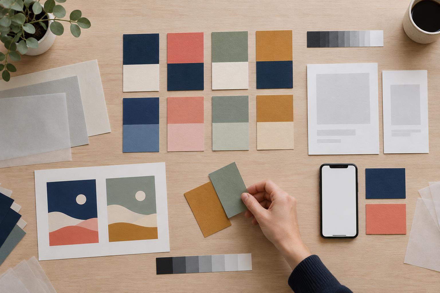
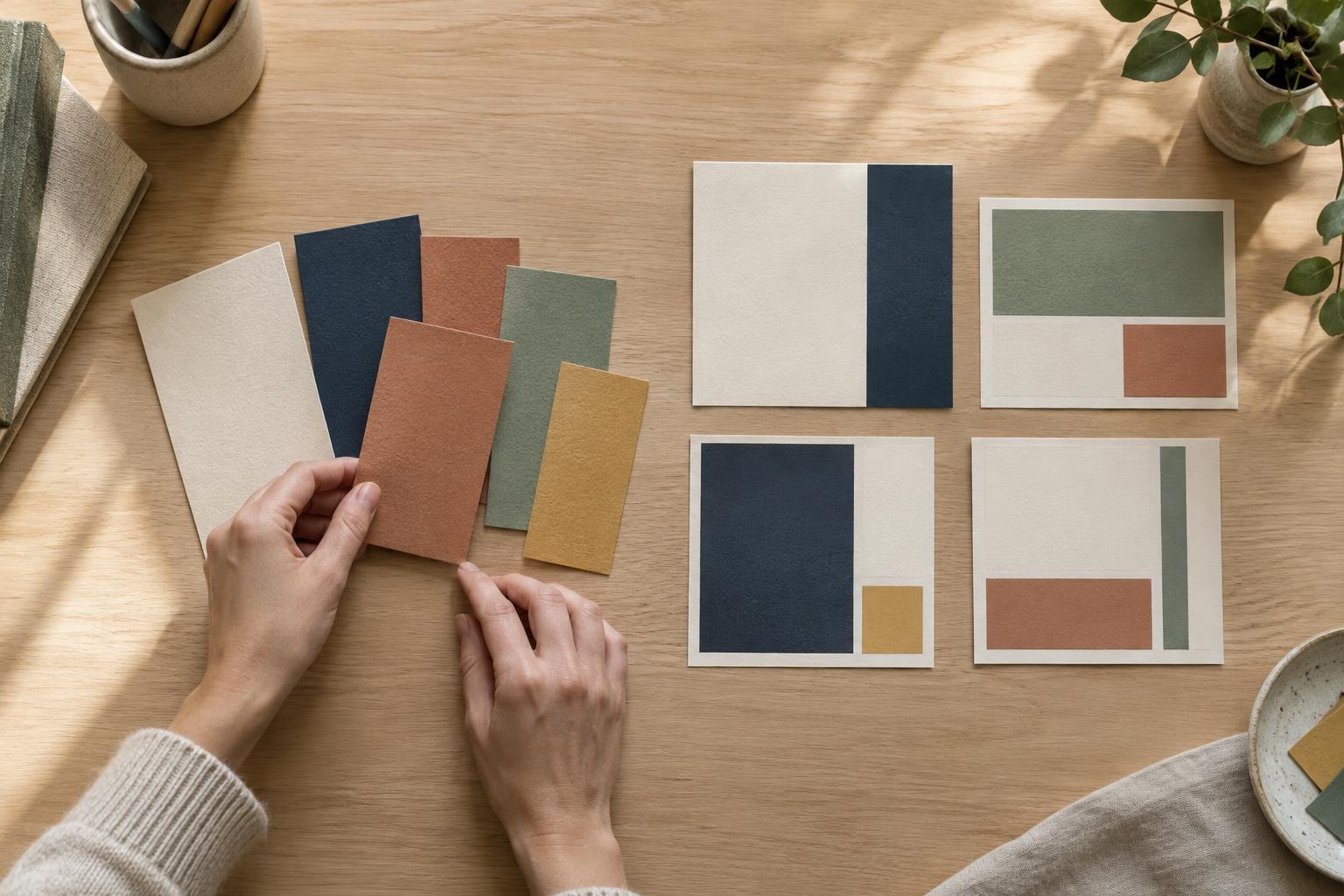
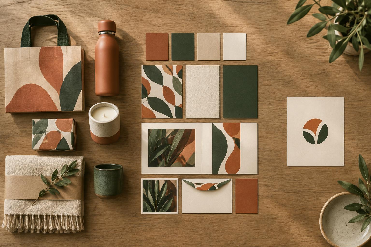
A visual identity is the collection of design elements and rules that give a project a recognisable appearance. It may include colours, typefaces, image style, illustration, layout, graphic shapes and guidance for combining them. A useful identity works across the places where people actually encounter the project, from a website and social posts to signs, packaging or a presentation.
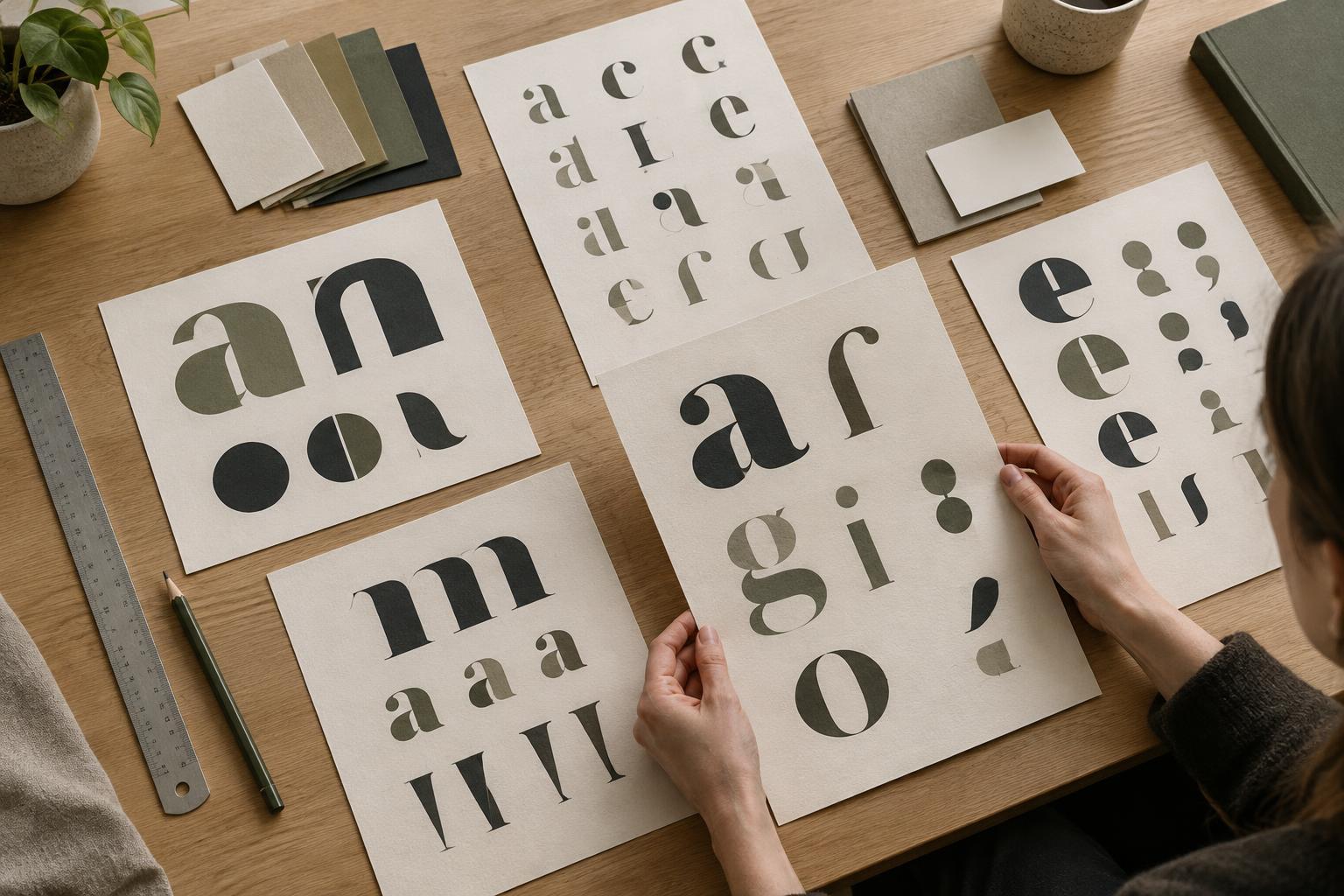
Consistency does not mean making every item look identical. A ceramics studio might use one type style for clear class information and a more expressive treatment for workshop posters. Both can belong to the same identity if their colours, imagery and layout principles relate to each other. The aim is to give creators enough structure to make new materials without having to reinvent the appearance each time.
Logo: a recognisable identifier
A logo is a visual identifier for a name, organisation or offering. It might be a wordmark made from styled lettering, a symbol, or a combination of the two. Its main job is to help people identify who is speaking or what they are looking at. A logo can communicate some character, but it cannot explain an entire mission or carry every message on its own.
That is why a logo should be considered in context. The ceramics studio may need it to work on a narrow website header, a printed class card and a small social profile image. A detailed symbol that looks appealing at poster size may be difficult to read when reduced. Testing a proposed logo at realistic sizes and alongside actual content tells you more than viewing it alone on a blank page.
Use the terms to write a better brief
Before starting a project, write three short lists. Under brand, note the audience, the experience you want to create and the qualities you want people to associate with the work. Under visual identity, list the materials you need to produce and the visual decisions that should stay consistent. Under logo, list the specific places an identifier must appear and any practical size or format constraints.
Then ask what is already working. If people understand the offering but its materials look unrelated, the priority may be a clearer visual identity rather than a new logo. If the offering itself is hard to describe, visual exploration may be premature. If everything works except a mark that becomes unreadable at small sizes, a focused logo update may be enough. Naming the actual problem helps keep the project proportionate and gives everyone a clearer way to evaluate the result.