Define what needs to survive
Start by separating legibility from recognition. Legibility asks whether someone can read the name or letters in a logo. Recognition asks whether they can identify the brand from its shape, colour or symbol. A mark might succeed at one and fail at the other: a familiar icon can be recognisable even when its accompanying name is unreadable. For a new identity, do not assume viewers will recognise a tiny symbol without the name.
List the places where the logo will actually appear: a mobile website header, social profile image, presentation footer, product label or small printed card. Note whether each placement needs the full name, a symbol, or both. This gives the test a useful question: not simply “Does it look good small?” but “Can this version do its job in this placement?”
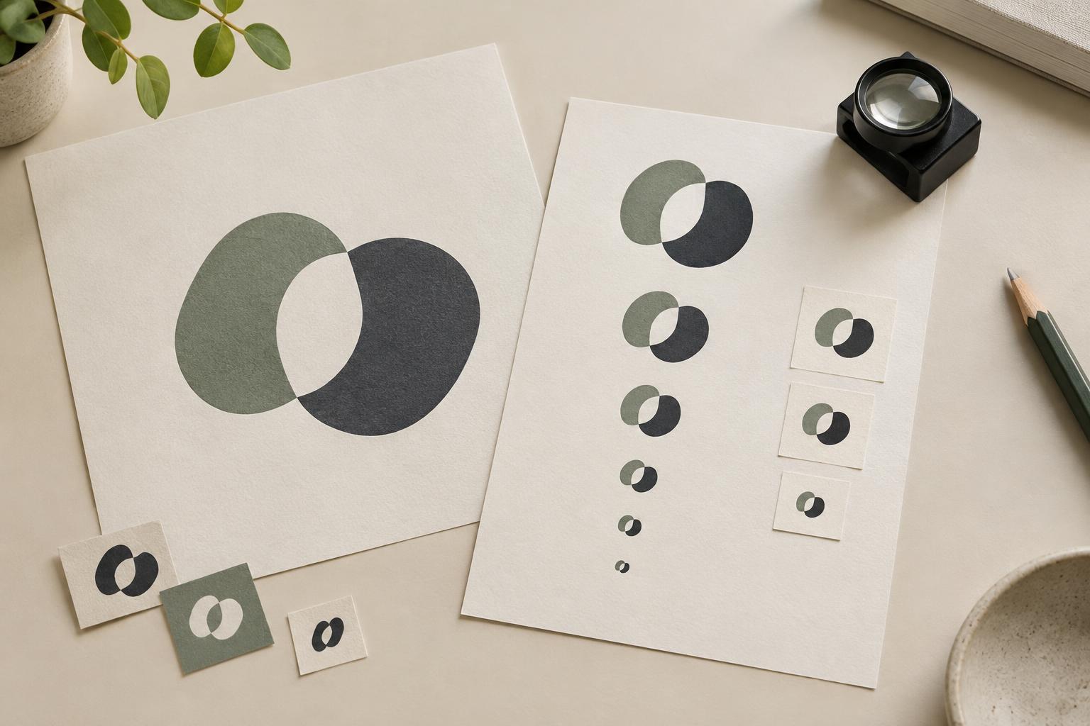
Build a realistic test sheet
Place the logo at several sizes on a page alongside examples of its intended uses. For digital placements, export the artwork at the pixel dimensions it will occupy and inspect it at normal viewing size, not enlarged on a design canvas. For print, make a sample at its intended physical size. Include a medium-size reference so you can see which details disappear as the mark gets smaller.
Test the logo on the backgrounds it will encounter, such as a light page, dark navigation bar, photograph or coloured label. Use a realistic amount of surrounding content rather than displaying every version in isolation. A logo that seems clear on an empty white field may struggle beside a menu, headline or image. If the identity has one-colour and reversed versions, include those too. This helps distinguish a size problem from a contrast or background problem.
Check more than the letterforms
First, look for an immediate read. Can you make out the name without zooming or recalling it from the larger reference? Then inspect the specific points of failure. Thin strokes may fade, small gaps may close, and closely spaced letters may merge. A tagline that reads well in a large lockup may turn into visual noise at a compact size. In a symbol, check whether its defining feature still appears distinct rather than becoming an unrecognisable blob.
Invite a few people who have not been studying the design to view the small versions in context. Show one version at a time, without the large logo beside it, and ask what they can read or describe. Avoid explaining the intended answer first. Note both accurate readings and hesitations: a name that takes several seconds to decipher may not work in a setting where people only glance at it. Keep the feedback tied to particular sizes and backgrounds so it points toward a useful revision.
Revise the cause, not just the scale
If letters merge, try increasing spacing or simplifying tight joins. If strokes disappear, adjust their weight while checking that the overall character of the mark remains intact. If a symbol loses its identity, remove minor internal details or enlarge the feature that distinguishes it. If contrast is the issue, prepare an appropriate light or dark version rather than relying on one file for every background.
Sometimes the best fix is a responsive set of logo versions. A full lockup can serve spacious layouts, while a version without the tagline works in narrow headers. A compact symbol or monogram can suit an avatar, provided the wider identity helps people connect it to the name. These are deliberate variations, not arbitrary replacements. Keep key proportions, shapes or colours consistent enough that the versions still feel related. After each change, repeat the small-size test; a revision that improves one application can create a new problem elsewhere.
Set a practical rule for use
Once you find the smallest size at which each version performs its intended job, record that result in a simple usage guide. Specify which version belongs in common placements, the minimum size you tested, suitable background treatments and any elements that should be removed rather than squeezed. Treat the minimum as a guideline for those conditions, not a universal promise: display quality, printing methods and surrounding clutter can change the outcome.
Save examples of successful uses alongside examples to avoid. A small card showing a readable header logo, a clear avatar and a rejected tagline treatment can be more useful to collaborators than an abstract measurement alone. Recheck the identity when a new placement appears. The goal is not to force the full logo into every available space, but to make sure each application communicates clearly at the size people will actually see.