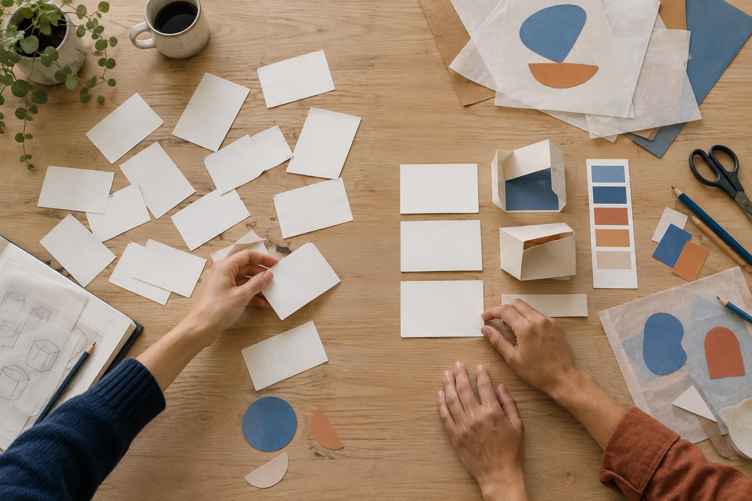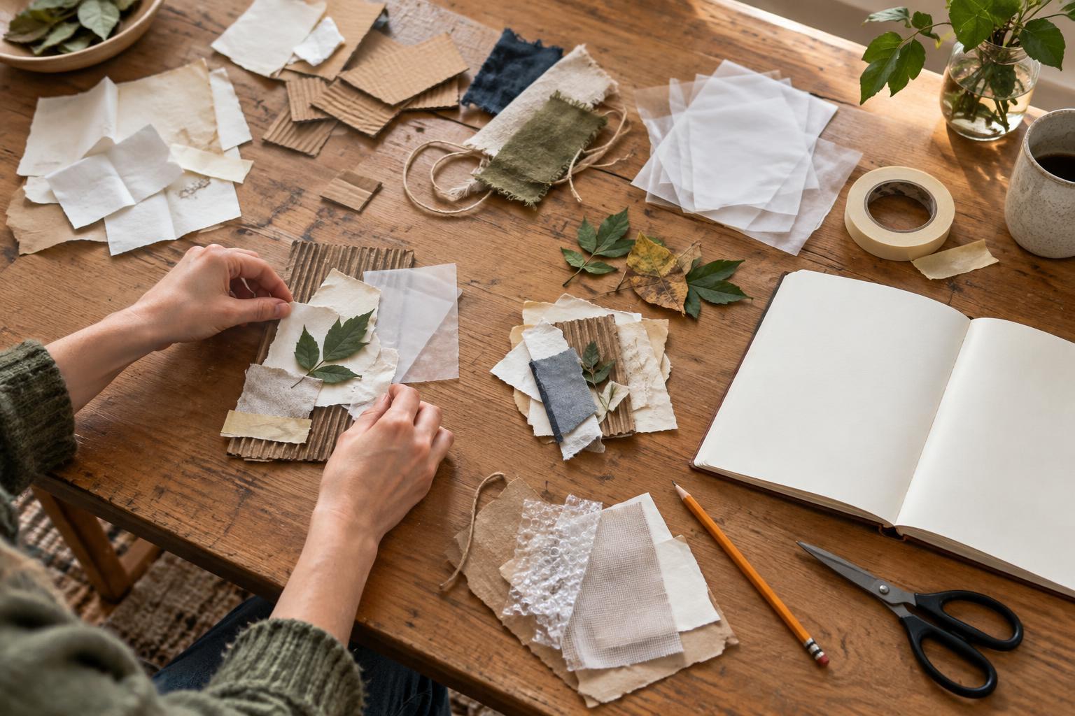
Start with an intention, not a collection
A mood board is most useful early in a project, when the team needs a shared sense of direction but is not ready to choose a final look. It can communicate qualities such as warmth, restraint, energy or curiosity. It does not need to settle the logo, color palette, typeface or layout. Treat it as a conversation tool: a way to show what a direction might feel like before deciding what it will be.
Before collecting images, write one sentence about the intended experience. For example: “This should feel welcoming and quietly confident, like entering a well-used studio.” Then add two or three words that sharpen that thought, such as tactile, open and unhurried. If the words could describe almost any project, make them more specific. “Playful” might become “playful without feeling childish.” That distinction will help you choose references and explain why they belong.
Collect references for qualities, not solutions
Look beyond work in the same category as your project. A board for a visual identity might include a photograph of light falling across a table, the texture of folded paper, the spacing on a book cover or the movement in a short series of images. Each reference should contribute a quality you want to explore, rather than offer a design to copy.
As you collect, make a brief note about each choice. What matters: the generous space, the uneven edges, the soft contrast or the sense of motion? These notes protect you from a common problem: choosing images because they are attractive, even though they point in different directions. Gather more than you need, but keep the collection manageable enough to compare. A quick exercise is to select three references for each of your guiding words, then look for qualities that appear across more than one group.
Edit until the feeling is clear
A mood board becomes stronger through removal. Lay out your candidates and ask what each one adds. If two images say the same thing, keep the one that communicates it more clearly. If a reference is visually striking but pulls the board toward a different mood, set it aside. You are not judging whether an image is good; you are judging whether it helps this particular conversation.
Watch for references that look too much like proposed deliverables. A polished logo or complete website screen may prompt people to comment on its details instead of the feeling behind it. If you need such a reference, crop it to show the relevant quality or add a note explaining what to notice. For instance, “the relaxed spacing, not the typeface” gives viewers permission to respond to the intended idea without treating the example as a recommendation.
Arrange the board to suggest a direction
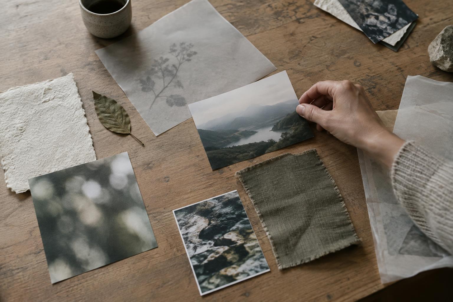
Placement changes how a board reads. Give the most important reference room to breathe, then use smaller images to support or complicate it. Group images that share a quality, such as quiet lighting or lively repetition. Leave enough space between groups for viewers to see relationships rather than one dense collage. A board does not have to be perfectly balanced, but its structure should help someone understand where to look first.
Consider including different kinds of evidence: an image for atmosphere, a material for texture, an example of pacing or composition, and a few words that name the intended response. This variety makes the direction more useful to photographers, designers, writers and collaborators. Keep labels short and specific. “Warmth through natural light and imperfect surfaces” explains more than “warm and authentic,” while still leaving room for several possible design outcomes.
Present it as a question you can test
When sharing the board, introduce the intention before asking for reactions. You might say, “We are exploring a calm, approachable direction; these references show the pace and texture, not final assets.” Then ask focused questions: Which image best conveys the intended feeling? Is anything working against it? What feels missing? These questions tend to produce more useful feedback than a general request for likes or dislikes.
After the discussion, write down the qualities people agreed on and the points that remain uncertain. You can then make a small test, such as a rough composition, a photography shot list or a few lines of sample copy. The test helps you see whether the feeling survives contact with actual project materials. The board has done its job when it gives you a clearer way to make and evaluate those next decisions, not when every detail on it appears in the final work.