Start with the messages people need to find
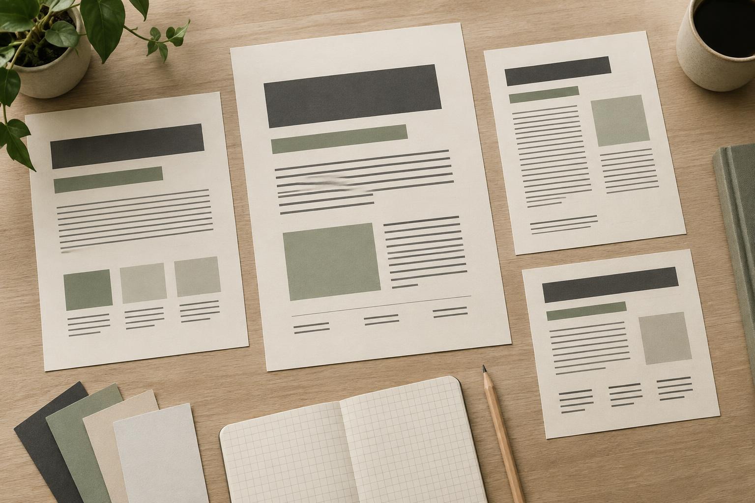
A type hierarchy is the set of visual cues that tells a reader what to notice first, what belongs together and where to look next. Size is one cue, but weight, spacing, alignment and placement also shape the reading order. A consistent hierarchy makes a brand recognizable without requiring every piece of communication to use the same layout.
Before choosing sizes, gather a small set of materials the brand actually needs: perhaps a homepage, a social post, an event invitation and a one-page proposal. Label the information in each. Which words identify the subject? Which explain the offer? Which give details such as location or next steps? This inventory reveals recurring jobs for type. It also exposes exceptions, such as a short quotation or a long product name, that a system should be able to handle.
Give each type style a clear job
Define a few roles before designing individual pages. Most teams need a prominent headline, a supporting heading, body text and a quieter style for labels or supplementary details. A call to action may need its own treatment if it appears often. Name these styles by function rather than appearance: “section heading” remains useful even if its font or size changes later.
For example, a ceramics studio might use a bold headline to introduce a new class, a smaller heading to distinguish the schedule from the description, comfortable body text to explain what participants will make, and compact labels for dates and materials. The goal is not to give every sentence a distinct look. It is to make the same kinds of information recognizable wherever they appear. If two styles seem to do the same job, try combining them.
Build distinction without losing connection
Choose typefaces and styles that suit the brand’s voice and work in its common formats. One versatile type family can provide enough variation through weight and size; a second family can add character if it has a specific role. Check that the fonts remain readable in longer passages and that the team can use them in the tools it relies on. A striking headline style is less helpful if it breaks down on a narrow screen or cannot handle the words the team regularly writes.
Create noticeable differences between levels, but judge them in context rather than by a size list alone. A heading can gain emphasis through space around it, while a label can stay small if it has adequate contrast and room to breathe. Keep body text easy to read, particularly in dense layouts. Avoid relying on color alone to separate information: weight, size and position can reinforce the distinction when color is unavailable or difficult to see.
Test the hierarchy on real content
Apply the proposed styles to the materials collected at the start. Use realistic headlines, including an awkwardly long one, and actual-length body copy rather than perfectly balanced placeholders. Then look away and return to each layout. Can you identify the main message quickly? Is the next action clear? Does any label compete with the headline, or does a supporting detail disappear?
Test at the sizes and distances at which people are likely to encounter the work. A social post viewed on a phone, a printed handout held in the hand and a presentation seen across a room ask different things of type. The hierarchy should retain its logic even when particular sizes change. If it fails, adjust the relationship between roles before adding more styles. Often a change to spacing or line length solves a problem that initially looks like a font problem.
Document decisions so the system stays useful
Turn the tested hierarchy into a short reference that a teammate can use without recreating the design process. Include each style’s name, purpose and typical treatment, along with examples in at least two formats. Note which elements may adapt for small screens or crowded layouts. Show a few common mistakes, such as using the headline style for every announcement or shrinking body text to fit too much copy.
Treat the reference as a working tool, not a collection of rigid measurements. When a new format appears, first ask which existing roles its content needs. Add a new role only if an important kind of information cannot be expressed clearly with the current set. This keeps brand communications coherent while leaving room for different subjects, formats and ideas.